20 Worst Logo Design Fails
After looking at 36 wonderful examples of Logos With Hidden Symbolism, it’s time to see the world’s worst logo design fails.
Although marketers say that a good logo design should immediately catch the viewer’s eye, however, if you did manage to grab everyones attention – that doesn’t necessary mean you are doing good. There is probably just some nasty hidden message seen only when you rotate your logo. Remember, always look twice, and one more time upside down!
1. Catholic Church’s Archdiocesan Youth Commission
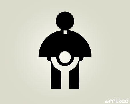
This is an actual logo designed in 1973 for the Catholic Church’s Archdiocesan Youth Commission. It even won an award from the Art Directors Club of Los Angeles.
2. Zune Logo Backwards
No, really, there’s nothing wrong with this one. (zune.net)
3. Dodge Viper Logo: Daffy Duck
Viewed upside down, it looks like Daffy Duck. Not so scary after all.
4. The Texas Longhorns
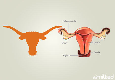
Pretty self explanatory.
5. A-Style Logo
The double-meaning in this one was actually intentional. So, it’s probably more a WIN than a fail.
6. Office of Government Commerce
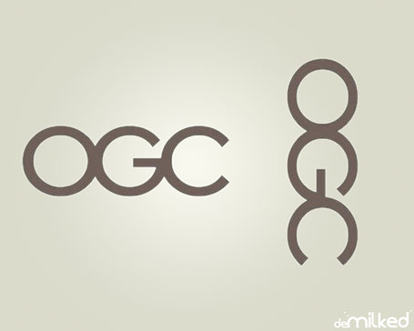
The Office of Government Commerce (OGC) is an independent Office of the Treasury. Sometimes you need to shift your view to realize the error. www.ogc.gov.uk
7. Mont-Sat
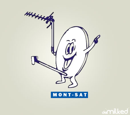
And you wonder why Mr. Satellite looks so happy? www.mont-sat.pl
8. Sat An
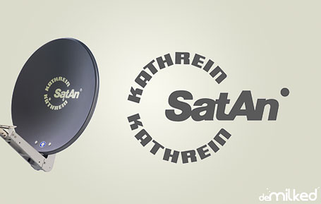
Satattelite and Antenna systems. Another masterpiece from a satellite company.
9. Arlington Pediatric Center

Just checked their website, and apparently they have changed their logo to something more pleasing. It’s no longer a pedophilic center. Now it has something to do with crabs (look attentively at letter C). FAIL again or is it their marketing strategy? www.arlpedcen.org
10. Pepsi
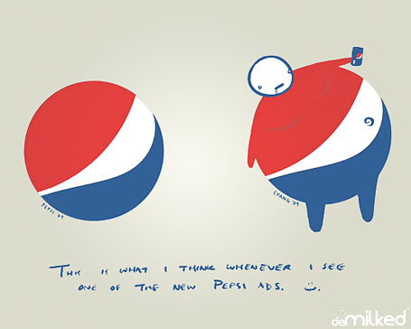
While all this might look like a joke, it gets even funnier when you look at the Pepsi Max logo. (Lawrence Yang)

You’ll never look at the Pepsi logo the same again.
11. Clinica Dental

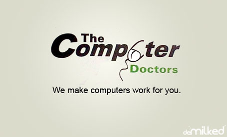
12. Computer Doctors
13. Locum
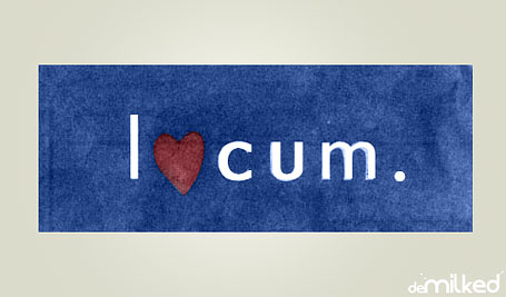
Locum, a Swedish property management company, used this special edition of their logo during Christmas.
14. CatWear

15. Institute Of Oriental Studies
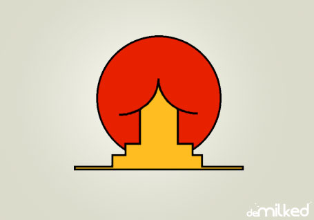
Yes, it’s just a house under a rising sun..
16. TGV Logo: Snail
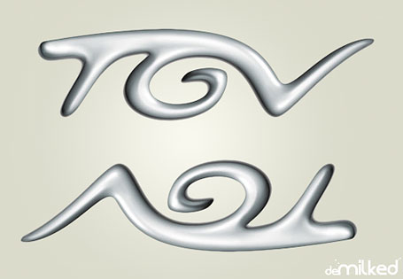
Flip it upside down and you’ll get a snail. By the way, TGV is France’s high-speed rail service, and “TGV” is an abbreviation for “Train à Grande Vitesse”, meaning high-speed train in French[1].
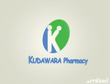
17. Kudawara Pharmacy
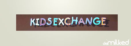
18. Kidsexchange
19. Junior Jazz Dance Classes

You have to have a really malicious mind to see this one.
20. Olympic Logo of London 2012
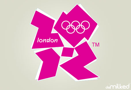
Designed by Wolff Olins at an expenditure of almost $800,000[1].


Got wisdom to pour?
…is the London Olympic one supposed to have some hidden picture, or is it just fugly?
I believe the right part of the image is a person standing on their knees in a blow job position.
I ONLY saw the female, not the dancers, until I really looked. What does that say about me?
if you can find it add the bestway logo to this list. it mixs the “b” and “w” together but just spells “bj” in nice glossy letters
19. was a pretty smart sh*t, I mean if you watch them individually you can’t catch it but if you see the BIG PIC then lmao T*TTIES t*tties let me have them, let me plunge in, damn I’m nasty
#4? Make a better argument than that please.
These are brilliant! I’ve often paraded the OGC one around as being the greatest example of poor design/thought, though now have a whole host of others!
Cheers,
Matt
I’ve also seen a truck of a furniture company with a chair in their logo that looks 100% like a penis :) Unfortunately, it was already gone when I got my camera out of the pocket :(
LOL, this was funny! Especially the first one, haha ^^
How could companies do not notice such things in their logos? :D
#19 drove me crazy!! it took 5 minutes to figure it out! Oh, I’m so releaved now! Phew!
so, why on earth didn’t you tell what was wrong with it? Now it’s driving me nuts too :(
TITS.
Thanks!! I was looking and loooking and nothing… And then I looked with your answer and… there they were :)