Minimalism in Packaging Design
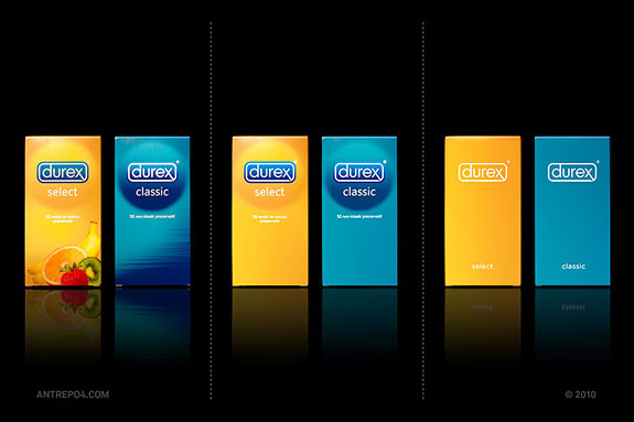
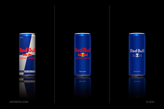
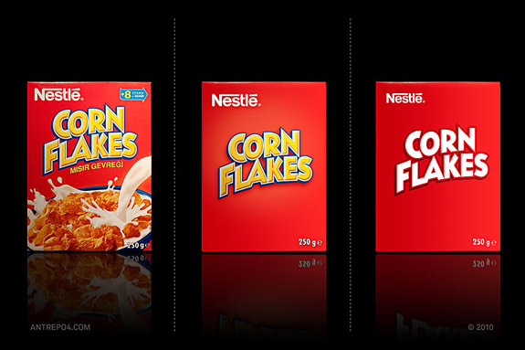
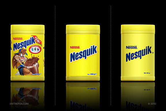
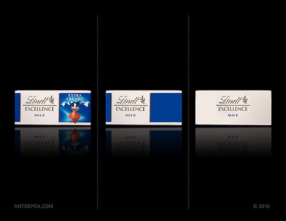
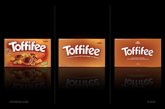
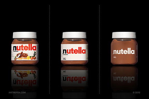
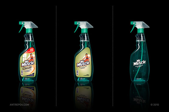
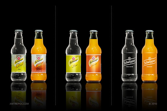
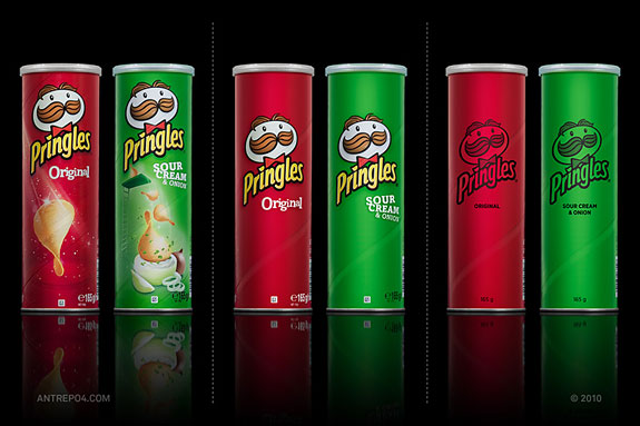
The folks at Antrepo made an interesting project called “minimalist effect in a maximalist market” where they have taken several well-known consumer brands and stripped their packaging designs back to the bare bones.
“Our last project is about simplicity and we try to find alternate simple versions for some package samples of the international brands. We think almost every product needs some review for minimal feeling.”
Which version do you like best and why? Would the same approach work on weaker brands?
Website: www.a2591.com


Got wisdom to pour?
durex: 3
Redbull: 1
Corn Flakes: 1
Nesquik: 1
Lindt: 3
Toffifee: 2
Nutella: 3
Mr. Muscle: 2
Schweppes: 2
Pringles: 2
These packaging styles are so
beautiful; it makes me wish I had designed it myself. Very jealous! The idea of
making user-friendly medical package is a too rare occurrence. This package makes
daily use easy through great packaging design supported by a step-by-step
package.
I think schweppes could really use this minimalist bottle design
I love the minimalistic lindt and schweppes designs.. very aesthetic.. :)
Don’t know about you guys, but I always read all the information provided on the package, and as a rule the less information is provided the less I’m likely to buy the product.
I don’t think that minimalistic designs look better, for me they look like low budget products
Great idea. However I like a middle version for almost all packages, the last one is too much simplified.
in some products I liked the most simplistic version, in others I liked the middle version, anyway I think being able to do it for your brand would show the strength of the brand, that everything is coded in the name/color already, and that there is nothing left to say.