
20 Times People Spotted Funnily Aligned Phrases On Signs And Posters (New Pics)
There are many things that can go wrong when you are creating a signboard or poster. Most word-related mistakes are grammatical but sometimes people mess up with the placement of words too. And you can find all of those mistakes in this subreddit called Don’t Dead Open Inside. Just like the name of the subreddit, its posts also contain examples of badly constructed and misaligned phrases.
According to the moderator of this subreddit, people can post any “signs/media that read as nonsense if read normally: from left to right”. Scroll below to check out some hilarious word-arrangement fails posted on this subreddit. And if you wish to see more such funny fails, check out our previous posts here and here.
#1

Image source: hotdogcolors
#2

Image source: nowakhm
#3

Image source: ketawut
#4
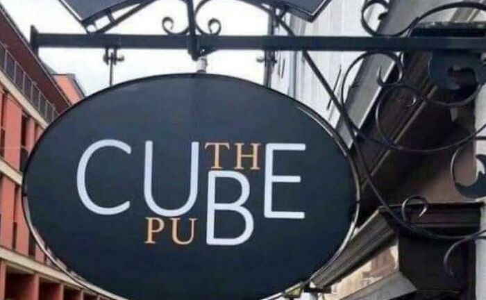
Image source: gothchick99
#5

Image source: MrShiftyJack
#6
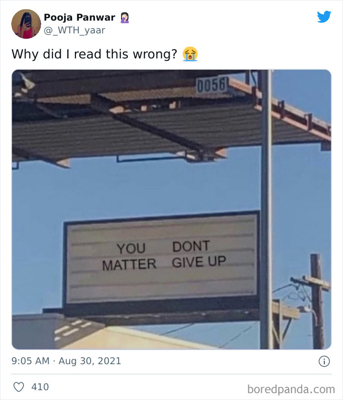
Image source: _WTH_yaar
#7
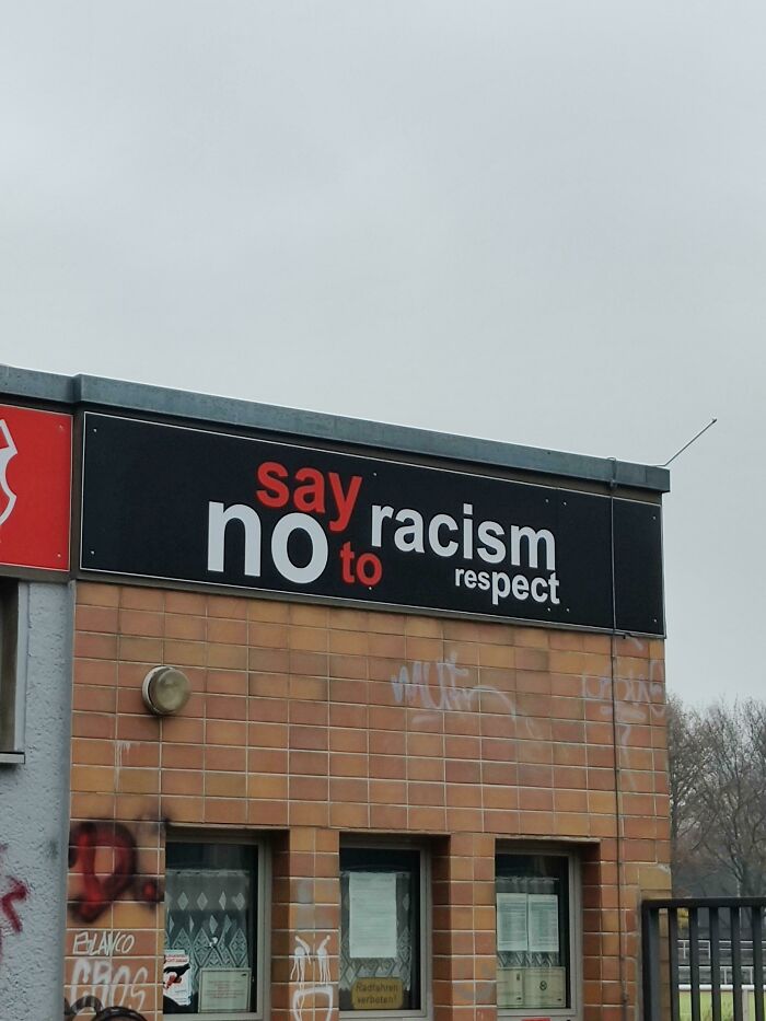
Image source: Bellgrim
#8

Image source: aaronmcc122
#9

Image source: Legitimate_Regret168
#10

Image source: orsiborsi88
#11
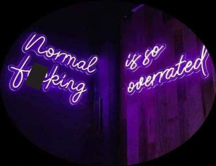
Image source: HappyChefChristoph
#12
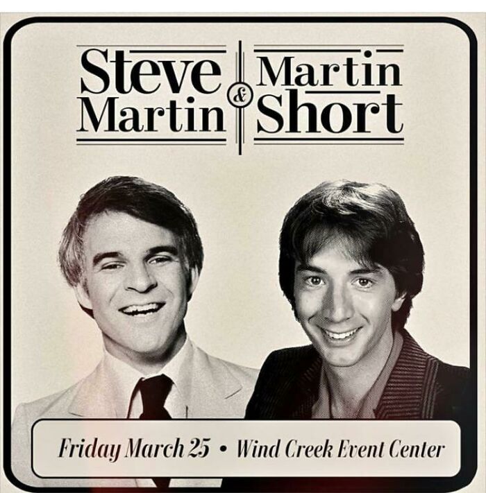
Image source: KarateKid84Fan
#13

Image source: CommieG
#14

Image source: _temporarilystairs_
#15

Image source: shrobotic
#16

Image source: KaibaMixi
#17

Image source: fight_milk38
#18

Image source: spameggsspamandspam
#19
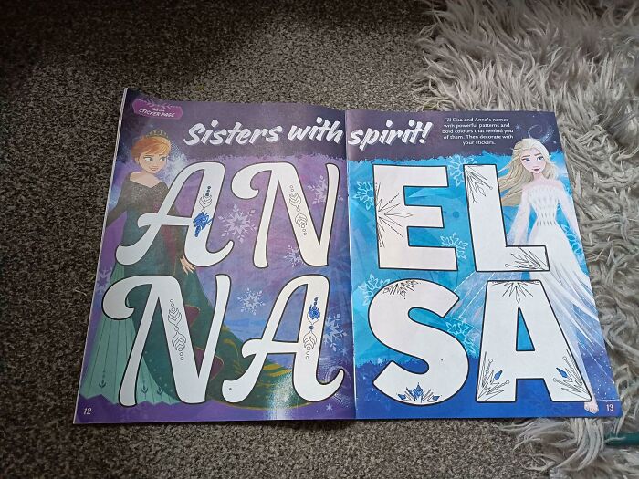
Image source: Floppy76
#20

Image source: BobLablah1




Got wisdom to pour?