
15 Creative Crosswalk Advertisements
When traditional advertising fails to attract people’s attention, it’s probably time for something new (and that doesn’t necessary mean spending a lot of money). A good way to start is by choosing a different and even atypical medium to put your message, for example crosswalks!
Not only your message will be very well geographically targeted, but also seen multiple times by the same people, and in the end it may even go viral on the Internet. Of course, guerrilla marketing requires more brain power than money, but it’s definitely worth a try!
Here is a list of 15 most creative crosswalk advertising examples – so be ready to milk some inspiration for your next advertising campaign!
1. Bin Your Butts
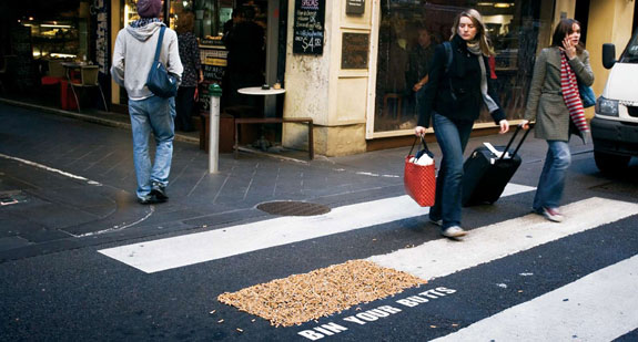
“Don’t be a toser, bin your butts.” (Advertising Agency: GREY, Melbourne, Australia)
2. FedEx: Kinko
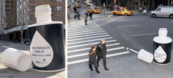
(Advertising Agency: BBDO, New York, USA)
3. McFries Crossing
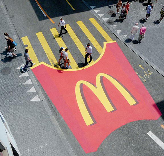
(Advertising Agency: TBWA Switzerland)
4. Bubbles Hair Salon
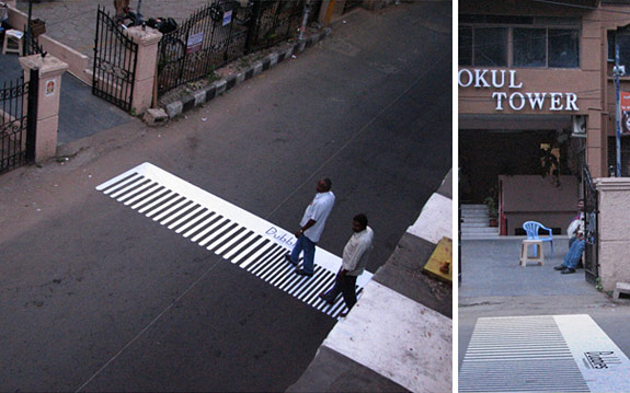
(Advertising Agency: Orchard Advertising, Chennai, India)
5. Symphony Crossing
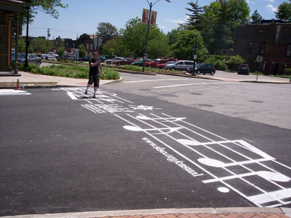
(Advertising Agency: unknown)
6. Latina Insurance: Crosswalk Abyss

“Crosswalks are safer.” (Advertising Agency: Pragma DDB, Lima, Peru)
7. Consoziocc.it
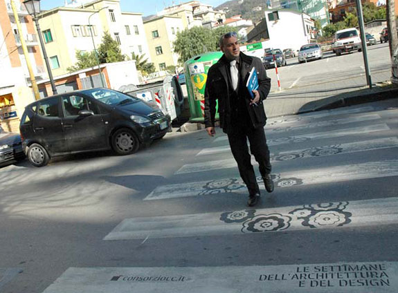
8. ACA-M : Zebra Crossing Memorial
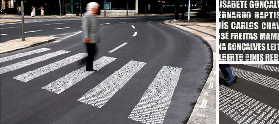
“1⁄4 of car accident victims are pedestrians” (Advertising Agency: Draft FCB, Lisbon, Portugal)
9. Headsetproductions.com
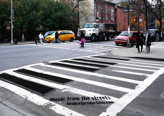
(Advertising Agency: unknown)
10. Sentieri Urbani
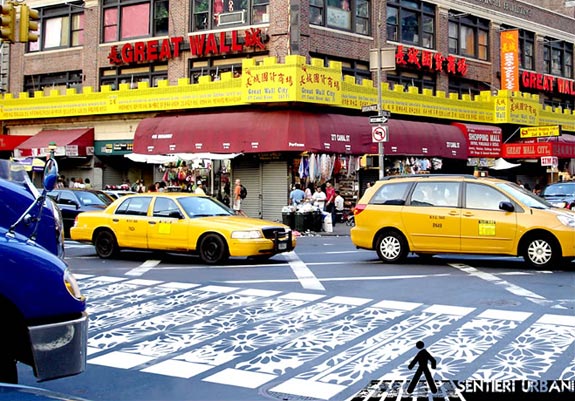
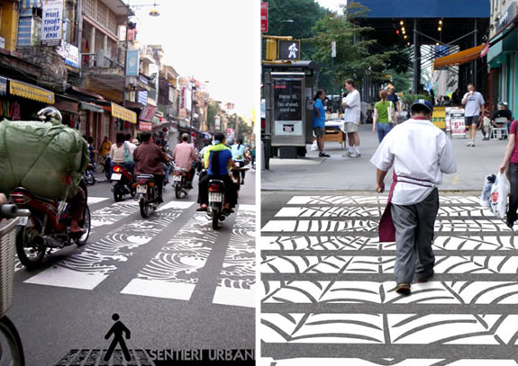
Sentieri Urbani is a project by two brothers, Davide and Gabriele Adriano, that aims to reinvent zebra crossings to communicate the distinct identities of cities where display their works.
11. Salzburg School of Music: Piano crosswalk
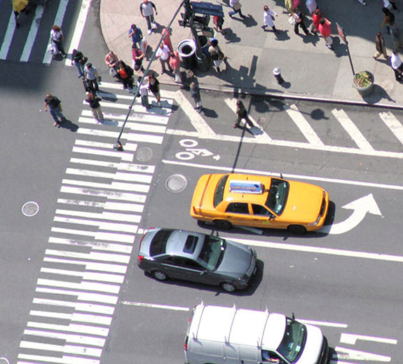
(Creative Director / Art Director: Pedro Martins)
12. Shopping Curitiba: Barcode
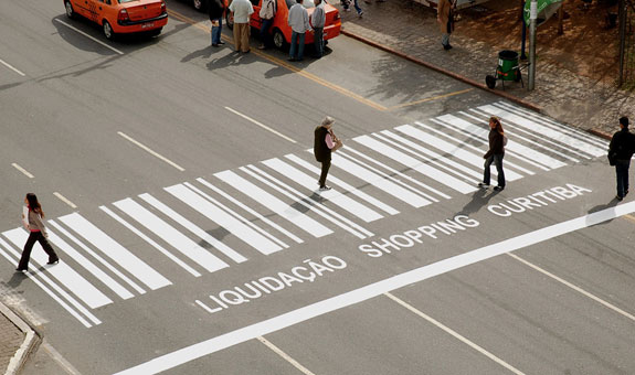
(Advertising Agency: OpusMúltipla, Curitiba, Brazil)
13. South Africa Tourism
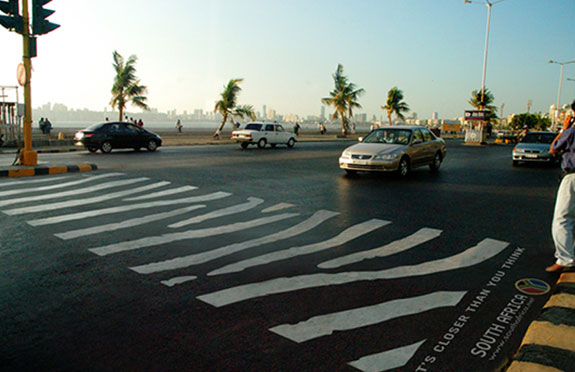
Ambient idea for South Africa Tourism. Zebra Crossing signs around traffic lights in Mumbai were painted to look like the stripes of a real zebra. (Agency: unknown)
14. Altschul Orthodontics: Crosswalk
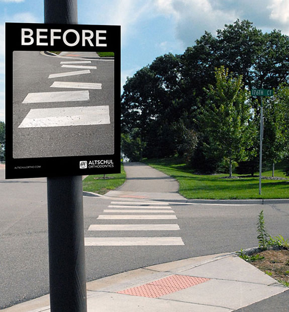
(Advertising Agency: Marked for Trade, USA)
15. Meister Proper
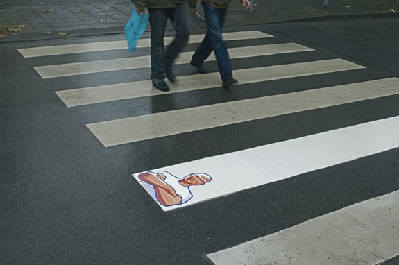
(Advertising Agency: Grey Worldwide, Germany)


Got wisdom to pour?
it would be “funny” if someone got hurt in such crosswalk because technically you may argue if it’s still a crosswalk at all.
I agree, that mr proper is the best one! Simplicity is genius
Mr. Clean?
mm…. now I want mcFries, after seeing this:D
#8 is kind of ironic. If people stand in the crosswalk, reading the memorial they just might be a victum of a traffic accident. Strange idea.. all in all very nice ads
Great! I’ve never seen anything like that
Great list, Mr. Proper is definitely the best one!