14 Beautiful Tips For Graphic Designers
Graphic designers follow certain rules to make their work look good. Here are some tips paired with motivational images to illustrate them. Follow these rules, and you’ll be on your way to makeing crisp and clean images that please the eye and entice the users to click the Facebook share button. Leave MS Paint and Comic Sans for the amateurs – you’re designing like a pro now!
The tips were collected and created by Poppie Pack, a senior graphic designer at Canva. She has experience with branding and publishing. She’s also writes many posts on design tips, all for the benefit of budding designers.
More info: canva.com | facebook | twitter | instagram (h/t: designtaxi)
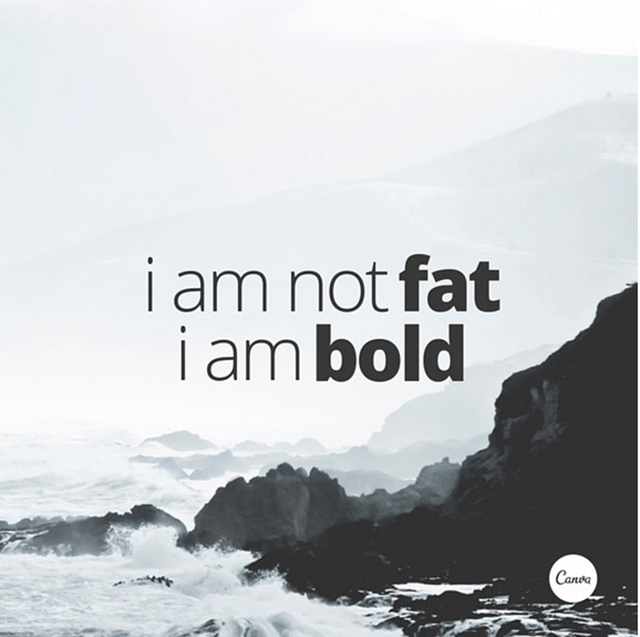
Use Light And Bold Font Variants For Emphasis And Impact.

Crop Images To Let Them Act As Background Textures.

Typefaces Have Personalities Too. Make Sure You Represent Your Message With The Right Fonts.

Choose A Geometric Typeface Teamed With An Elegant Serif For A Happy Pairing.

Apply A Grid To Create A Clean Composition, Using One Of The Photo Holders As A Text Box.

Contrasting Typefaces Make A Great Duo.

The Placement Of Text Is A Crucial Element. Make Sure To Break Your Lines Up The Way It Should Be Read.

Create Clever Compositions By Letting The Features Within Images Guide Where To Place Your Type.

Use Shapes To Create Contrast And Offset Your Text From Your Background Image.

Make Beautiful Collages With Your Favorite Photos Using Grids, Ensure To Apply The Same Filter To Each Image For Consistency.

Apply A Tint To Your Image The Same As Any Block Color In Your Design For Consistency.

Aesthetics! Composition! Adjust All The Elements In Your Graphic So They Are On Corresponding Angles.

Use The Combination Of A Tint And X-process To Create Two-tone Filter Effects.

Use Areas With Clear Space In Your Images For Creative Ways To Include Text.


Got wisdom to pour?
If you suddenly need reliable hosting for your projects, come here.