20 Logo Designs That Might Make You Question “Who Approved Them?”
A well-designed logo can create a strong visual impact and leave a lasting impression on consumers. However, there are instances when logo designs miss the mark completely, leaving us puzzled and wondering who gave the final approval.
Check out some of the most hilarious logo designs that are so amusing, you can’t help but chuckle and question who in their right mind approved them. Get ready for a good laugh!
#1 Ordered Jordan’s Online. Got Fake Ones, Jordan Logo Has An A*s Crack. Wtf Lol

Image source: Hunchmine
#2 Vermont Maple Syrup Logo

Image source: manfredaman
#3 Don’t Overthink This, It’s Just A Handball Club Logo

Image source: tarandfeathers
#4 This Logo Of A Turkish Water Brand. It Obviously Sucks

Image source: sercan35
#5 South Dakota’s Logo For A New Anti-Meth Campaign

Image source: adamhasabeard
#6 iSmart’s Logo Really Thew Me For A Second

Image source: TinaTeaspoon
#7 “Yes, A Hanged Family Would Make A Great Logo For Our Company”

Image source: refeer
#8 This Logo Design!!

Image source: FaustoYoshihara
#9 Your Logo Designer Is Still Laughing

Image source: 1morepic_really
#10 I Just Feel Like Someone Should’ve Noticed How Bad The Logo Is

Image source: reddit.com
#11 An Unfortunate Logo For A Fitness Center

Image source: Dingwallace
#12 Not The Greatest Logo

Image source: 1aappyy
#13 Unfortunate Placement Of The Facebook Logo

Image source: tanghel
#14 This Store Is Called Jupiter, Their Logo Is The Moon

Image source: GaraMind
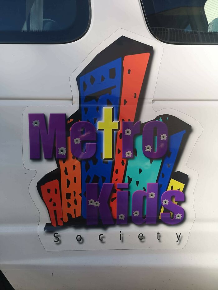
#15 This Kids Society Logo… The Bullet Holes Are An Interesting Touch

Image source: clarkj1988
#16 Someone Paid Money For This To Be Their Sign And Logo/Mascot. I’m Convinced This Is Drug Lord’s Money Laundering Business

Image source: SoDakZak
#17 Russian Bread Company Logo. Literally Cra**y Design

Image source: WildWasteland42
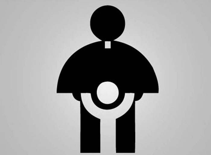
#18 The Logo For The 1973 Archdiocese Youth Commission

Image source: Krackajak_78
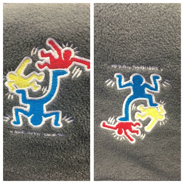
#19 Logo For A Children’s Hospital. Right Side Up Is A Man Juggling/Playing With Kids. Upside Down Is An Angry Man Stomping On Kids

Image source: bb_or_not_bb
#20 This Dentist’s Choice Of Logo Near My House

Image source: krukemeyer


Got wisdom to pour?