
11 Fonts That Designers “Love” More Than Anything
I loved Comic Sans… when I was 14. Designers hate it – and here is a list by Creative Market’s Joshua Johnson of some other fonts that attracts their wrath. You can call them fonts or typefaces as the terms are becoming synonymous these days. The thing is, the fonts are annoying. They are either overused to the point of absurdity, or illegible, or both.
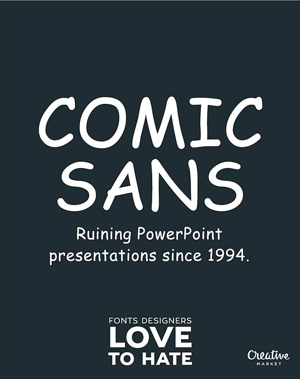
Comic Sans MS is the best known, most widely hated font in the world. The font is simple and whimsical – unfortunately, people choose to use it everywhere and for everything. Misuse and oversaturation are the largest strikes against the font.
Granted, not all of fonts are irredeemable. The author himself loves Helvetica, but,he has heard and read many designers speak out against it. And of course, the readers are encouraged to vent their additional font-strations, like with typefaces like Cooper Black, Impact and Copperplate.
More info: creativemarket.com (h/t: designtaxi)








Got wisdom to pour?
I began using Comic sans for my Powerpoint notes, which my students dutifully printed. Then I learned it is the most ink consuming font. I went back and reformatted all my notes in Arial. They look better, are easier to read (both on and off screen) and my students spend less replacingink cartridges.